
Building in Minecraft is as much about aesthetics as it is about structural integrity. Whether you’re constructing a cozy cottage, a sprawling castle, or a functional base, the colors you choose define the entire mood and visual impact of your project. Yet many builders skip straight to their favorite blocks without considering how those colors work together, and the result is often a chaotic mess that looks worse than the sum of its parts. Mastering the Minecraft color palette isn’t just for creative-mode architects: it’s a fundamental skill that separates good builds from truly memorable ones. This guide will walk you through how Minecraft’s color system works, which blocks deliver the exact shades you need, and the proven techniques pros use to create builds that don’t just look good, they look intentional.
Key Takeaways
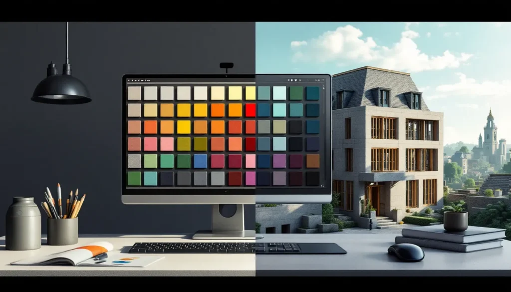
- Mastering the Minecraft color palette separates good builds from memorable ones by using intentional color choices rooted in RGB values and biome-specific rendering rather than random block selection.
- Dyed blocks like wool, concrete, and terracotta provide consistent, color-accurate materials, while natural blocks like wood types and stone offer authentic terrain colors that vary across biomes.
- Create cohesive Minecraft builds using monochromatic designs, complementary/analogous color schemes, or a neutral 80/20 palette where neutral tones dominate and accent colors provide visual interest.
- Texture variation within the same color family—mixing concrete, wool, and terracotta in matching hues—adds depth and sophistication without disrupting your overall color palette.
- Apply the 70-20-10 design rule: 70% primary neutral color, 20% secondary color, 10% accents, and limit your Minecraft color palette to 3-4 core colors to avoid visual chaos and color fatigue.
- Test color palettes in creative mode across different lighting conditions (daylight, night, underwater, caves) and use biome-inspired palettes like warm savanna tones or cool taiga schemes to instantly communicate your build’s intended vibe.
Understanding Minecraft’s Native Color System
Before you can master color in Minecraft, you need to understand how the game actually renders it. Every block in Minecraft is assigned RGB (Red, Green, Blue) values, which determine its exact color on your screen. The game doesn’t use some abstract color system, it uses the same RGB standard as digital displays everywhere, which means understanding the numbers behind the colors gives you real control over your palette.
How Minecraft Blocks Render Colors
Minecraft’s block colors are determined by a combination of texture files and multiplier values. When you place a block in-game, the engine reads the texture image and applies a color multiplier based on biome data, lighting, and the block’s built-in color attributes. This is why the same grass block looks slightly different in a desert biome versus a forest, the game is multiplying the base texture color by biome-specific values.
For dyed materials like wool, concrete, and terracotta, the system is more straightforward. The game applies a specific RGB tint to the base texture, which is why a blue wool block always looks like the same shade of blue regardless of biome (with minor lighting variations). This consistency is what makes dyed blocks so valuable for color-accurate building, you know exactly what you’re getting.
Lighting also plays a critical role in how colors appear. A red concrete block in full daylight looks vibrant, but the same block in a dark cave or at night becomes a murky shadow. Shaders and higher render distances can intensify this effect, making color choice even more important in competitive or showcase builds.
RGB Values In Minecraft Editions
Different editions of Minecraft handle color slightly differently, which matters if you’re building across platforms. Java Edition provides the most precise control and allows direct access to color data through mods and resource packs. Bedrock Edition (available on Windows 10/11, Xbox, PS, Switch, and mobile) uses the same RGB system but renders slightly differently due to rendering engine differences.
In Java Edition, dyed wool blocks use standard RGB values: white wool is RGB(255, 255, 255), black wool is RGB(0, 0, 0), and red wool is RGB(192, 57, 43). These values don’t change, they’re hardcoded into the game. Secondary blocks like concrete and terracotta use the same color values but with different textures, which gives them a distinct visual character even though matching RGB values.
Bedrock Edition compresses the palette slightly differently and may render colors with a subtle variance, but the core blocks remain the same across platforms. If you’re playing on Switch or mobile, the color palette is identical to what Java players see, the only difference is rendering performance and visual effects like ambient occlusion, not the actual color values.
Understanding this distinction means you can plan builds knowing they’ll look consistent wherever you play them. The color palette is universal: only the visual polish changes between editions.
Essential Minecraft Blocks & Their Color Properties
With the technical foundation covered, it’s time to look at the actual blocks that make up your color palette. Not all blocks are created equal when it comes to color consistency and visual impact. Some deliver exactly the shade you need: others work better as texture than pure color.
Wool, Concrete, & Dye-Able Materials
Wool is the standard-bearer for color accuracy in Minecraft. It comes in 16 dyes, each with a distinct color: white, light gray, gray, black, brown, red, orange, yellow, lime, green, cyan, light blue, blue, purple, magenta, and pink. The texture is solid and uniform, making it perfect for clean, flat-color builds. But, wool has a few drawbacks: it’s flammable (which matters if you’re near lava), it reflects light in a way that can look flat and artificial on large surfaces, and it doesn’t pair well with detailed building when you want texture variation.
Concrete is wool’s aesthetic upgrade. Available in the same 16 colors, concrete has a grainier, more industrial texture that looks less plastic than wool. It catches light differently and feels more modern, it’s the go-to for contemporary builds, tech bases, and anything that needs a sleek, finished look. Concrete powder (the pre-hardened version) is slightly lighter and less saturated, which is useful for subtle color variation.
Terracotta offers weathered, earthy tones. Hardened terracotta and glazed terracotta come in the full 16-color spectrum and have a rustic, clay-like appearance. The texture is irregular, which adds visual interest without requiring multiple block types. This makes terracotta ideal for organic, natural-looking builds like villages, cottages, and farmland. Glazed terracotta (created by cooking colored terracotta in a furnace) has a glossy finish that’s perfect for accents and detail work.
Other dye-able materials worth knowing: stained glass (perfect for windows and skylights without losing the color), dyed shulker boxes (for color-coded storage), and banners (which allow custom color combinations and patterns). Each has its own visual character and best-use case.
Natural Blocks & Terrain Colors
Not all colors in Minecraft come from dyed blocks. Natural terrain blocks offer authentic, biome-specific colors that you can’t replicate with dyes.
Dirt, grass, and stone are your foundation colors. Grass blocks in temperate biomes are a warm green: in desert biomes, they’re a dusty tan. Dark oak wood is nearly black: spruce wood is deep brown. These color variations exist because Minecraft was designed to reflect real-world terrain, and the color palette reflects that.
Wood types deserve special attention. Oak, spruce, birch, jungle, acacia, dark oak, and mangrove wood each have distinct colors. Oak is warm tan: spruce is chocolate brown: birch is pale cream: jungle is vibrant orange-brown: acacia is warm peachy-orange: dark oak is almost charcoal: mangrove is earthy reddish-brown. When choosing a build’s primary wood tone, you’re essentially choosing one of seven core color families.
Sandstone, red sandstone, and deepslate offer neutral, stone-based alternatives. Sandstone is pale cream: red sandstone is rust-orange: deepslate is cool blue-gray. These work as secondary colors or neutral bases that let other colors shine.
Nether and End blocks add exotic color options. Crimson and warped wood blocks offer unique purples, pinks, and teals that don’t naturally occur in the Overworld. Nether brick is dark reddish-brown: blackstone is deep gray-black. These are perfect for themed builds that need to feel alien or magical.
Decorative & Accent Color Blocks
Beyond the core palette, decorative blocks add color highlights and visual interest. Amethyst blocks are translucent purple and catch light beautifully. Copper starts as vibrant orange-brown and oxidizes to cyan over time, creating a unique color-changing element. Prismarine is aquamarine-blue: dark prismarine is deeper teal. Purpur blocks (from the End) are magenta-purple.
Colored concrete powder is lighter and less saturated than hardened concrete, useful for creating color gradients. Wool carpets (6 pixels tall instead of 12) are perfect for adding color detail without consuming a full block. Tinted glass is neutral gray and reduces light transmission, good for shading or creating mood.
The key to using decorative blocks effectively: they work best as accents, not primary surfaces. A room built entirely of amethyst blocks looks overwhelming: a room with amethyst accents or trim looks polished.
Creating Cohesive Color Palettes For Your Builds
Now that you know what blocks deliver which colors, it’s time to learn how to combine them into palettes that actually work. A cohesive color palette creates visual harmony, builds feel intentional and complete, not random.
Monochromatic & Single-Hue Designs
Monochromatic palettes use variations of a single color, from light to dark. This is the simplest approach and often the most effective. A monochromatic build using different shades of wood (light birch, medium oak, dark acacia) feels unified because your eye isn’t jumping between contrasting hues.
In practice, a monochromatic gray build might use light gray concrete as the primary wall, dark gray concrete for trim and detail, blackstone for accents, and deepslate for the base. The eye moves smoothly across the structure because it’s processing subtle value changes, not color shifts.
Single-hue designs are powerful because they’re forgiving. Even if your proportions or layout aren’t perfect, the limited color palette keeps the overall impression cohesive. This is why many professional builders start with monochromatic designs: it lets them focus on shape and detail without color confusion.
The risk: monochromatic builds can feel flat or boring if you don’t vary texture. Using multiple block types within the same color family (concrete, wool, terracotta, glazed terracotta) adds visual interest without breaking the color scheme.
Complementary & Analogous Color Schemes
Complementary colors sit opposite each other on the color wheel, blue and orange, red and cyan, yellow and purple. When used together, they create dynamic, eye-catching builds. A blue base with orange terracotta trim pops visually.
But, complementary palettes are high-risk in Minecraft. Two intense, saturated colors in equal amounts create visual chaos. The solution: use complementary colors in a ratio where one dominates and the other accents. A blue wool build with orange wood beams feels balanced: a 50/50 split of blue and orange looks amateurish.
Analogous colors sit next to each other on the color wheel, blue, cyan, and teal: or red, orange, and yellow. These palettes feel cohesive because the colors share undertones. An analogous palette of warm wood (oak, acacia) with red brick accents feels intentional.
Analogous palettes are safer than complementary ones because the colors naturally work together. They’re ideal for organic builds (nature-inspired structures, landscapes) where you want warmth or coolness to guide the eye without jarring contrast.
Neutral Base Palettes With Accent Colors
The most versatile approach: build 80% of the structure in neutral tones (gray, brown, beige, black) and reserve 20% for accent colors. Neutrals include light gray, dark gray, white concrete, deepslate, blackstone, stone, wood, and sandstone.
A neutral base stops color from overwhelming the build. It lets players focus on architectural details, shape, and proportion. Then, accent colors, cyan trim, purple roofing, orange details, add personality without creating visual noise.
Practical example: a large building with white concrete walls, deepslate accents, and oak wood framing is neutral-based. Add cyan-blue glazed terracotta windows and purple banners, and suddenly it has character. The accents stand out precisely because they’re swimming in a sea of neutral.
This approach also scales well. A small cottage with five accent colors looks chaotic: a large mansion with the same five colors distributed sparsely feels curated. Neutral bases let you add more accent colors without overwhelming the structure.
Advanced Techniques For Color Blending & Texture
Once you’ve mastered basic color theory, the next level involves using texture and lighting to enhance and refine your color palette.
Using Varied Block Textures To Enhance Colors
Here’s a pro secret: two blocks with nearly identical RGB values can look dramatically different if their textures are different. Wool, concrete, and terracotta might all be “blue,” but wool is smooth, concrete is grainy, and terracotta is rustic-clay-textured. Mixing them creates depth without changing the overall color.
Textural layering works because your eye interprets texture as detail and variation. A wall of pure concrete looks flat. A wall of concrete with concrete powder detailing, wool trim, and glazed terracotta accents looks designed, even if all three blocks are the same base color.
Advanced builders also use this principle for color suggestion. You can’t make a block darker without changing its color, but you can place darker-textured blocks adjacent to lighter-smooth ones, which creates the visual impression of shadow and depth. A dark oak beam next to white concrete looks 3D because the texture variation mimics how light would hit the structure.
Practical technique: within your chosen color palette, vary the number of block types. Use at least two different block types for each major color (e.g., cyan concrete + cyan terracotta, not just cyan concrete). The texture variation adds visual sophistication that screams “intentional design.”
Lighting & Shaders For Color Enhancement
Lighting is the unsung hero of color in Minecraft. The same blue concrete looks entirely different in full daylight versus under a skylight versus in darkness. Professional builders think about light when choosing colors.
In dark areas (caves, basements, interior rooms), avoid very dark colors because they’ll disappear in shadow. Light gray, white, and bright colors read better in darkness and create the impression of intentional lighting design. Conversely, if you want a moody space, darker colors like black concrete or dark prismarine paired with sparse lighting create atmosphere.
Shaders (which require mods like Optifine on Java Edition or can be used on Bedrock via resource packs) dramatically enhance color perception. High-quality shaders add realistic lighting, shadow, and ambient occlusion, they make colors look more saturated and true. If you’re building for screenshots or showcases, shaders will make your color palette look 10x better than vanilla lighting.
Lighting design itself is part of color. Warm lights (use glow stone, lanterns, campfires) make colors like orange, red, and yellow pop while cooling blues and cyans. Cool lights (use blue concrete as a light source via resource packs) enhance blues and purples while making warm colors feel cold. Strategic light placement doesn’t change your color palette, it emphasizes it.
One important note: if you’re building in vanilla survival without shaders, account for that flat, even lighting in your color choices. Colors that look perfect in a screenshot with professional shaders might look washed out in standard gameplay. Test your palette in both vanilla and modded conditions if the build needs to work in both contexts.
Popular Pre-Made Minecraft Color Palettes & Inspiration
You don’t have to invent every palette from scratch. Established color themes exist because they work, they’re battle-tested by thousands of builders.
Biome-Inspired Palettes
Each Minecraft biome has a built-in color identity, and successful builders lean into it. The savanna palette uses warm oranges, tans, and browns, acacia wood, sand, orange terracotta, and occasional dark oak. It feels arid and hot.
The taiga/forest palette uses cool greens, dark browns, and whites, spruce and dark oak wood, grass, snow, and occasional deepslate. It feels cold and ancient.
The desert palette is sand, red sandstone, dead bush (implied dryness), and occasionally brown concrete. It’s monochromatic warm.
The ocean palette leverages water itself as color, prismarine, dark prismarine, teal concrete, and light blue concrete with white foam details. It reads as aquatic instantly.
The nether palette is reds, blacks, and purples, crimson wood, nether brick, blackstone, and warped wood. It feels dangerous and alien.
The end palette is purples, blacks, and dark teals, purpur blocks, blackstone, and warped wood. It feels mystical.
Why are biome palettes powerful? They tap into players’ existing understanding of Minecraft aesthetics. A builder who uses the taiga palette correctly doesn’t need to explain their build’s vibe, players instantly understand it.
Seasonal & Themed Color Schemes
Beyond biomes, seasonal palettes work well for themed builds. Spring uses pastels, light pink concrete, pale green, light blue. Summer uses bright, saturated colors, lime, bright orange, cyan. Autumn uses warm oranges, reds, and browns, consistent with acacia and jungle wood. Winter uses whites, light grays, and cool blues.
Functional builds also have established palettes. Tech bases typically use gray, black, and occasional bright accent colors (cyan, magenta, lime). Cottages use warm wood, white concrete, brown terracotta. Castles use stone, dark gray, black, and occasionally bright primary colors for banners and trim.
Themed palettes work because they carry psychological weight. A player sees a tech base palette and expects futuristic functionality: they see a cottage palette and expect cozy, residential space. The colors prime expectations, which means your palette does heavy lifting in terms of communicating the build’s purpose.
Research into actual color theory can help here. If you’re interested in how professionals approach this topic, resources like gaming design guides on GameSpot and community discussions on Nexus Mods offer real examples of how top builders execute their palettes.
Tools & Resources For Picking Minecraft Colors
In 2026, builders have more tools than ever to explore and test color palettes before committing blocks.
In-Game Color Palettes & Building Guides
The simplest approach: use Minecraft’s built-in creative mode to test palettes. Load a creative world, build a test structure in your chosen colors, and evaluate how it looks in different lighting conditions. Test it at day, night, in caves, and under water. How does it look from different angles? This hands-on testing beats theory every time.
Minecraft’s dye naming system is your quick reference. There are 16 dyes, and each one produces consistent colors across wool, concrete, terracotta, and glass. Learning the 16-color index is your foundation. Professional builders often have a mental model: “Which dye is closest to the shade I need?” and start from there.
In-game, you can also sample colors from existing structures. If a player-created build has a color palette you admire, use F3+H (Java Edition) to inspect the blocks and note their names. This reverse-engineering approach has launched a thousand good builds.
Third-Party Tools & Mods For Color Selection
Out-of-game tools accelerate the process. Color palette generators (search “Minecraft color palette generator”) let you input a base color and see what the 16 dyes look like alongside it. Some tools simulate different lighting conditions, which is invaluable for pre-planning.
Mods on Java Edition take this further. Mods like Litematica let you visualize builds at scale before placing a single block, and you can paste custom skins and builds to evaluate color combinations. Optifine includes a color visualization tool that helps you preview shaders’ effects on your palette.
On Bedrock, behavior packs and resource packs can be customized to highlight specific block colors, helping you identify which blocks best match your vision.
Many builders also use external color tools (like Adobe Color or Coolors.co) to explore color theory, then translate those hex values into Minecraft’s nearest dye equivalents. This bridges digital color science and the game’s limited palette.
One critical resource worth mentioning: the community. Gaming guides and reviews on IGN often feature showcase builds with detailed color breakdowns, and community forums regularly share palette recommendations. Learning from others’ successes (and failures) accelerates your own expertise.
Practical Tips For Building With Color Palettes
Knowing color theory and having tools is one thing. Actually executing a cohesive build requires practical discipline.
Maintaining Consistency Across Structures
Large projects, mega bases, villages, castle complexes, require consistency. Nothing breaks immersion faster than a building that suddenly switches from your chosen palette midway through.
Practical workflow: create a reference build. Construct a small, complete example structure (like a cottage or watchtower) in your chosen palette. Use this as your visual guide as you build larger structures. If a new building deviates from the reference’s proportions, colors, or block mix, you’ll notice immediately.
Maintaining a color palette document helps. Literally write down (or screenshot) the blocks you’re using: “Primary: light gray concrete, Secondary: dark gray concrete, Accent: cyan terracotta, Details: oak wood frame.” Reference this as you build. It sounds tedious, but it prevents decision fatigue and ensures new builds match your existing architecture.
For mega builds with multiple builders, communication is critical. Ensure everyone knows the agreed palette and understands how to apply it. A shared resource pack or world download with sample builds helps prevent the dreaded “different builders used different color schemes” look.
Avoiding Color Fatigue & Overwhelming Builds
Color fatigue happens when a build uses too many colors or uses colors at the wrong saturation levels. A structure with six saturated colors looks chaotic. A structure with six desaturated colors looks muddy. The solution: limit your palette to 3-4 primary colors, use them at varying saturations, and deploy them strategically.
The 70-20-10 rule works in Minecraft: 70% of the build should be your primary, neutral color: 20% should be a secondary supporting color: 10% should be accent colors. This ratio creates visual harmony without monotony. A build that’s 30% each of three colors will feel chaotic in comparison.
Saturation management is subtle but critical. If all your colors are maximally saturated (bright blue, bright orange, bright green), they’re competing for attention. Tone down saturation on supporting colors, use darker or lighter versions, or use the same color in concrete and wool (one is grainier, one is smoother, creating a saturation shift via texture).
Test your completed build by looking at it from distance and from within. Colors that pop beautifully in close-up detail might look overwhelming from a distance. Step back regularly and ask: “Does this palette still feel intentional, or is it becoming visual noise?” If it’s trending toward noise, remove the accent colors that are least central to your design.
One final principle: leave breathing room. Don’t place blocks with competing colors adjacent to each other without a neutral buffer. A bright cyan block next to a bright magenta block next to bright orange is assault. Put gray or black concrete between them, and suddenly it reads as intentional contrast instead of chaos.
Building with color palettes is iterative. Your first pass might include 12 colors: your second refinement cuts that to 6: your final polish might be 4. This distillation process, removing colors that don’t serve the build, is what separates amateur from professional results. Every block should earn its place in your palette.
Conclusion
Mastering color palettes in Minecraft transforms how you build. It’s not magic, it’s applying color theory, understanding the game’s block system, and making deliberate choices rather than grabbing whatever looks cool in the moment. The difference between a build that looks acceptable and one that looks stunning often comes down to palette restraint and intentionality.
Start with monochromatic or neutral-based designs if you’re new to this. Experiment with biome-inspired palettes to see what vibes resonate with you. Use creative mode freely to test before committing to survival builds. Reference other builders’ work and reverse-engineer their palettes. As you internalize color relationships, you’ll start seeing Minecraft’s block palette as a genuine artist’s toolkit, not a limitation, but a specific palette that requires intention.
Your next build doesn’t need to reinvent color. It needs to respect it. Choose 3-4 core colors, understand why they work together, and commit to them. The results will speak for themselves. Builds with deliberate color palettes don’t just look better, they feel designed, which is the mark of a builder who understands their craft.
More Stories
Mastering Command Blocks In Minecraft: The Complete 2026 Guide
How Does Mending Work in Minecraft? A Complete Guide to Repairing Your Gear in 2026
How To Build The Ultimate Mob Farm In Minecraft: Complete Guide For 2026